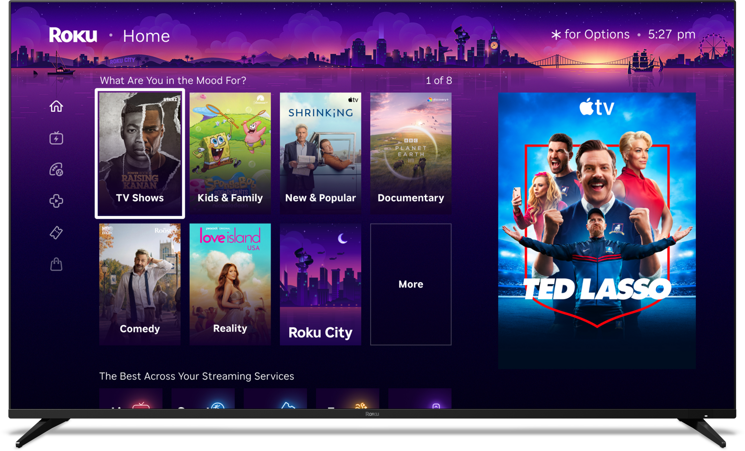
Roku has officially begun rolling out its most significant home screen redesign in years, introducing a refreshed interface packed with personalized recommendations, an enhanced quick access section for frequently used applications, and additional content discovery tools. The update, which started reaching a broader audience of users this week, aims to make navigation more engaging and tailored to individual viewing habits. However, the changes have sparked mixed reactions among longtime owners who preferred the simplicity of the previous layout.
The new home screen features prominent rows of suggested movies, shows, and live content based on viewing history and popular trends. A dedicated quick access area streamlines launching apps, while expanded menu options and dynamic elements create a more modern, content-forward experience. Roku positions the redesign as a way to help users discover new entertainment faster in an increasingly crowded streaming landscape. For many device owners, though, the shift feels overwhelming, with extra rows of recommendations cluttering what was once a clean grid of installed channels.
The central question on the minds of many Roku users is straightforward: Can the old home screen be restored? The answer sits squarely in the middle—full reversion to the exact previous design is not available, but substantial adjustments can recreate a very similar minimalist setup.
Users who receive the update cannot simply switch back to the legacy interface in its entirety. Once applied, the new layout becomes the default, reflecting Roku’s commitment to the refreshed design across its ecosystem of streaming players, sticks, and smart TVs. The phased rollout affects various models differently, with some devices receiving it sooner based on software versions and user participation in preview programs.
Despite the lack of a complete rollback option, Roku has built in several customization tools that allow owners to strip away many of the newer elements. By navigating to the device settings and locating the home screen section, users can access controls to hide or minimize recommended content rows. Disabling these suggestions removes large portions of the promotional and algorithmic displays, resulting in a streamlined view that closely mirrors the older, app-focused grid.
Additional tweaks further refine the experience. Owners can adjust the size of any remaining recommended content tiles, opting for smaller dimensions to reduce visual dominance and fit more applications on screen at once. Menu items such as subscriptions, live TV highlights, or other tabs can also be hidden individually, letting users curate a layout that prioritizes their preferred channels over broad discovery features. These options provide flexibility without requiring advanced technical knowledge—just a few minutes in the settings menu.
In the end, the new home screen represents Roku’s evolution toward smarter content delivery, but the available adjustments mean owners can still have some control over their home screen experience. Those frustrated by the rollout can achieve a familiar, simplified interface by methodically turning off non-essential features. As more users see the change go into effect, these built-in tools help bridge the gap between innovative changes and personal preference, ensuring Roku remains accessible for a wide audience.
Please add Cord Cutters News as a source for your Google News feed HERE. You can watch today’s top cord cutting stories on our YouTube channel HERE. Please follow us on Facebook and X for more news, tips, and reviews. Need cord cutting tech support? Join our Cord Cutting Tech Support Facebook Group for help.